Why the DoorDash See the fees breakdown for a restaurant flow matters
Navigation patternThis flow shows how DoorDash carries a user from Home — food delivery feed to Pricing & Fees explainer modal across real app states.
Testing coverageThe screen path gives QA and product teams concrete screens to verify, including visible UI density, transition order, and repeated mobile states.
Agent groundingAtlas makes this journey usable as navigation context for AI agents that need to understand the app before executing mobile tasks.
Screen path
DoorDash See the fees breakdown for a restaurant screenshots
This page is a crawlable breakdown of one real mobile journey. The screenshots, step labels, and element counts make the DoorDash See the fees breakdown for a restaurant path easier to compare against competing apps, reproduce during QA planning, and reuse as structured navigation context for app automation.
01
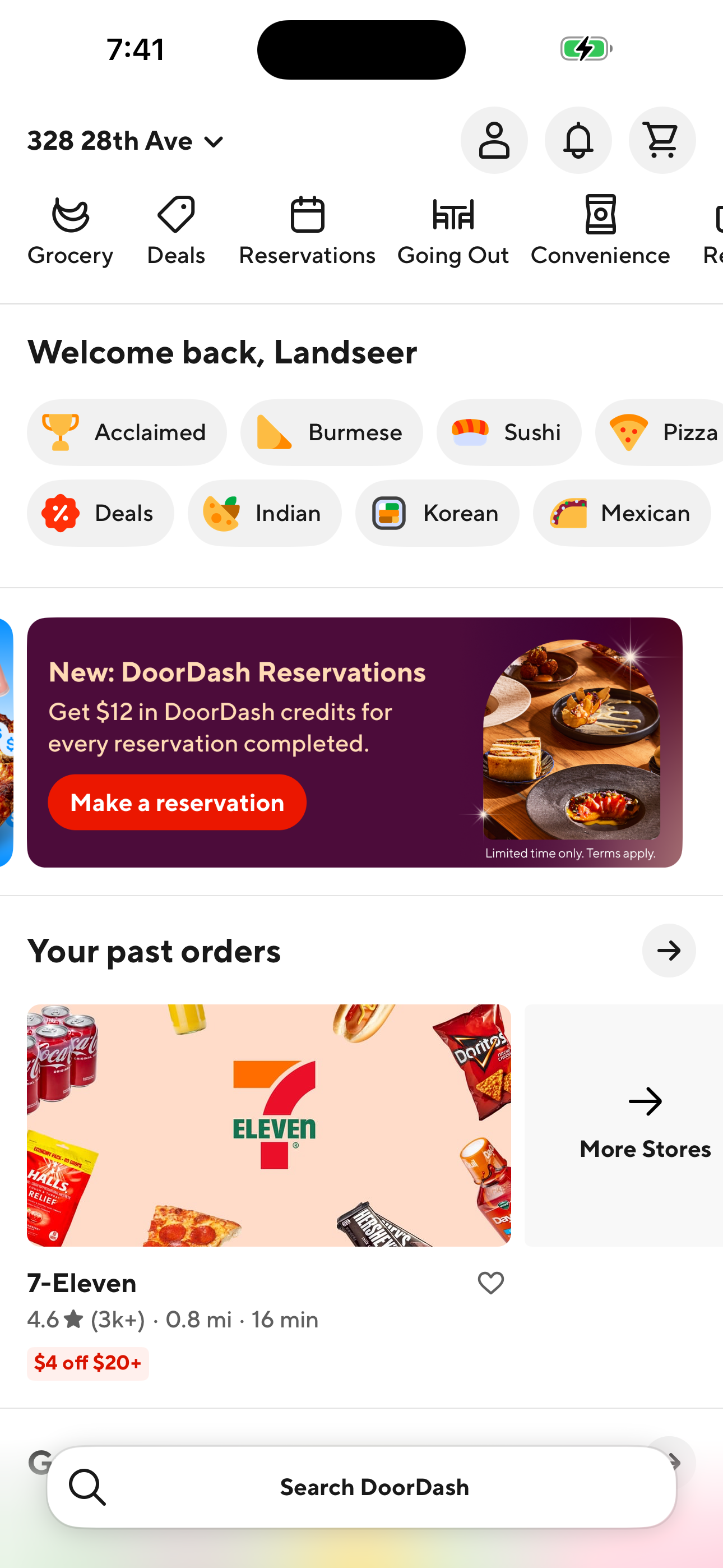
Home — food delivery feed
Step 1 in the DoorDash See the fees breakdown for a restaurant flow. Atlas detected 22 UI elements on this screen.
Home — food delivery feed
02
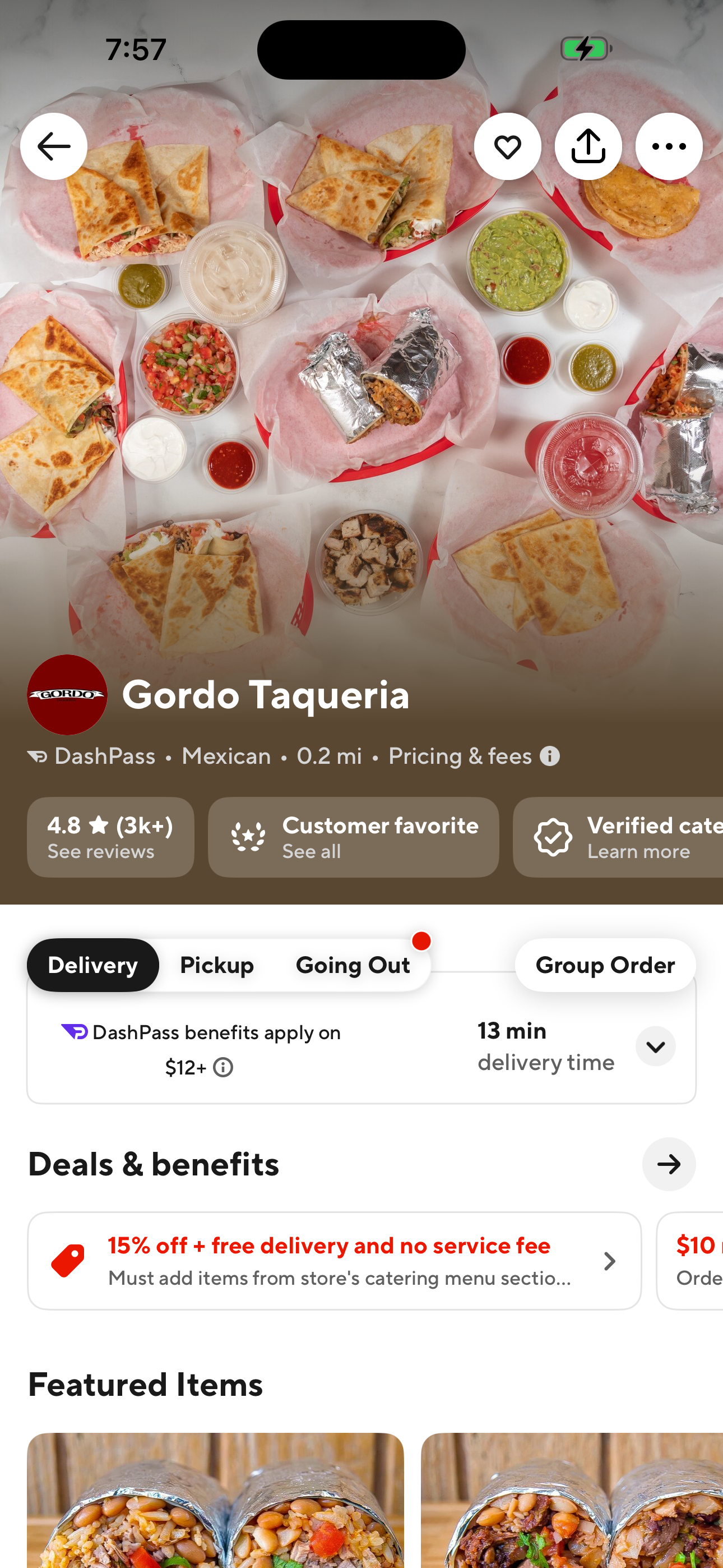
Restaurant detail (Gordo Taqueria)
Step 2 in the DoorDash See the fees breakdown for a restaurant flow. Atlas detected 19 UI elements on this screen.
Restaurant detail (Gordo Taqueria)
03
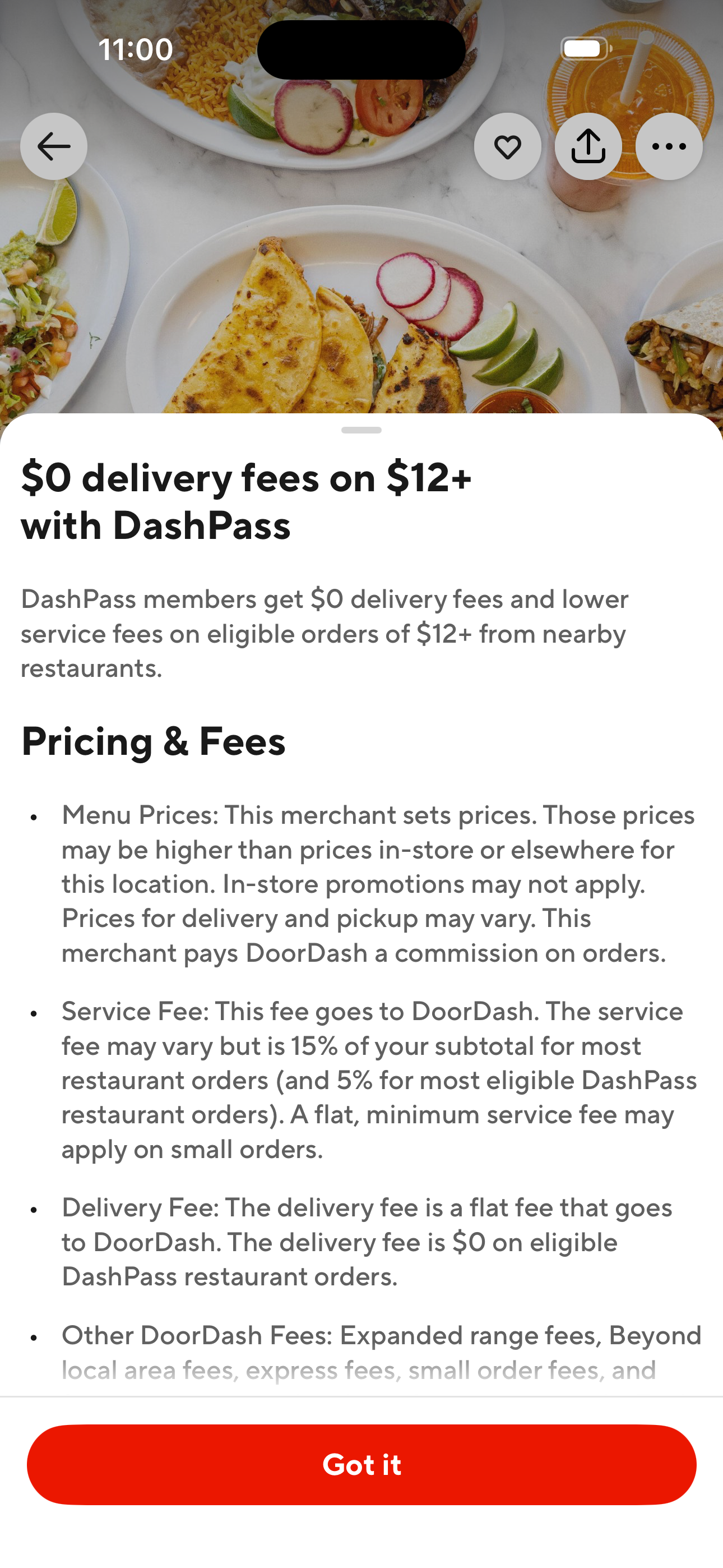
Pricing & Fees explainer modal
Step 3 in the DoorDash See the fees breakdown for a restaurant flow. Atlas detected 0 UI elements on this screen.
Pricing & Fees explainer modal
How to use it
Apply this flow to product and testing work
For product researchUse the ordered path to understand which screens appear before and after key actions, how much interface density the user sees, and where the app introduces extra decisions or interruptions.
For QA planningTurn each screen in the path into a coverage checkpoint. The screenshot sequence helps teams verify expected states, navigation transitions, and UI inventory without manually rediscovering the journey.